Design4 min
How we design our type scale
What we kept, what we cut, and why.
Cam Okafor
The small decisions that make the product feel quieter.
Every color in the product now maps to a role, not a hue. Designers pick "border" or "muted text", and the system decides what that means in light and dark mode. This post covers what we changed, why, and what it means for you.
Motion should explain, not decorate. If an animation does not tell you where something came from or where it went, we remove it.
Good defaults are invisible. You notice them only when they are missing, usually at the worst possible moment.
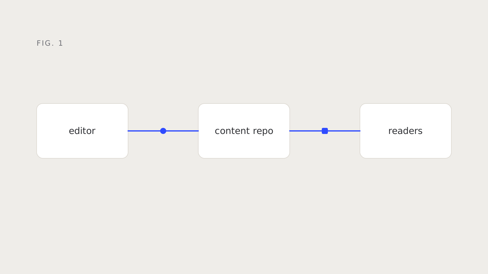
Hairlines carry more structure than you would expect. A single one-pixel rule can replace a card, a shadow and a background, and the page gets quieter.
Consistency is a feature you ship once and maintain forever. Our lint rules now catch one-off sizes and colors before they reach review.
We tested each change with the people who use the product all day. The best feedback was rarely about how something looked, and almost always about how it felt to repeat.
export async function publish(post: Post) {
  const problems = validate(post);
  if (problems.length) return { ok: false, problems };
  await commit(post);
  return { ok: true, url: `/blog/${post.slug}/` };
}We started from the text. Body copy sets the rhythm for everything else, so we fixed its size and line height first and derived the rest of the scale from there.
Every color in the product now maps to a role, not a hue. Designers pick "border" or "muted text", and the system decides what that means in light and dark mode.
Motion should explain, not decorate. If an animation does not tell you where something came from or where it went, we remove it.
Good defaults are invisible. You notice them only when they are missing, usually at the worst possible moment.
Hairlines carry more structure than you would expect. A single one-pixel rule can replace a card, a shadow and a background, and the page gets quieter.
“Good defaults are invisible until they are missing.”
Consistency is a feature you ship once and maintain forever. Our lint rules now catch one-off sizes and colors before they reach review.
We tested each change with the people who use the product all day. The best feedback was rarely about how something looked, and almost always about how it felt to repeat.
We started from the text. Body copy sets the rhythm for everything else, so we fixed its size and line height first and derived the rest of the scale from there.
Every color in the product now maps to a role, not a hue. Designers pick "border" or "muted text", and the system decides what that means in light and dark mode.
Motion should explain, not decorate. If an animation does not tell you where something came from or where it went, we remove it.
Design4 min
What we kept, what we cut, and why.
Design4 min
What we kept, what we cut, and why.
Design10 min
Good defaults, explained.